From Mood Board to Website Color Palette: My Process Revealed
Have you ever wondered how designers conjure up those perfect website color palettes that make websites sing? As a web designer, it's one of my favorite parts of the job. I could spend all day playing with colors and combinations. I'm excited to pull back the curtain and show you my process, along with the tools I love that make it a blast—both for me and my clients!
Color palettes are truly my jam! I love translating a client's vision into a beautiful and functional color scheme for their website. So, let’s get into it as I walk you through my process.
This blog post is written in a show notes style to help guide you through my process. For the full experience and to actually see my workflow step-by-step, I encourage you to watch the video. Seeing the tools in action will give you a much clearer picture of how I translate a mood board into a cohesive color palette.
My Toolkit: Color Palette Pro and Beyond
The heart of my website color palette creation lies in a fantastic tool called Color Palette Pro from Color Palette Studio. They offer an amazing suite of tools for all things color, from crafting mood boards to designing color palettes and pairing fonts. I highly recommend checking them out, whether you're a designer or a DIY enthusiast. I’ve been using their tools for about a year now, and they just keep getting better!
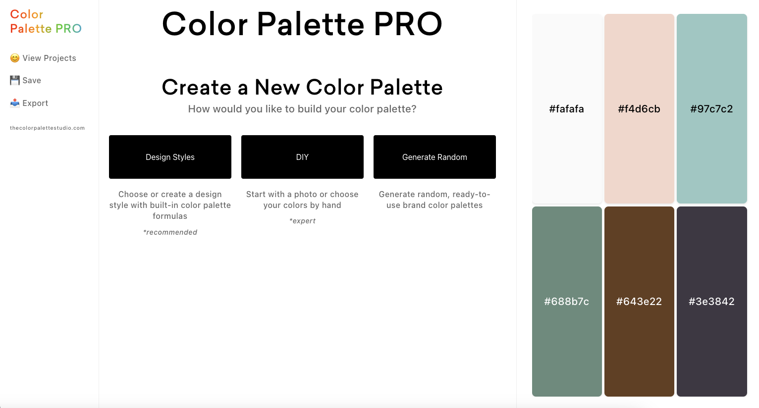
When you log into Color Palette Pro, you're greeted with several options. You can start with their pre-designed styles for inspiration. Alternatively, you can jump into DIY mode, begin with a photo or mood board, or even let the tool generate random color palettes for you. The random generator is constantly creating new palettes, offering endless inspiration!
Step-by-Step: Crafting a Website Color Palette from a Mood Board
Starting with Inspiration
When I work with a client, I usually opt for the DIY approach. This is because I typically have a collection of inspiring images that I want to incorporate. Often, clients provide me with images that inspire them. I take those images and distill them down to create a cohesive mood board. And yup, I use Color Palette Studio's mood board tool for that, too. It makes it so quick!
Setting Up the Palette
Next, I set the number of colors I want in my palette. I usually go with five. Why five? Because Squarespace has a five-color limit for its website color palettes. Read this post next to learn more about how to add and use your color palette in Squarespace. (I even share a tip on how to use more colors than your Squarespace palette allows!)
Uploading the Mood Board
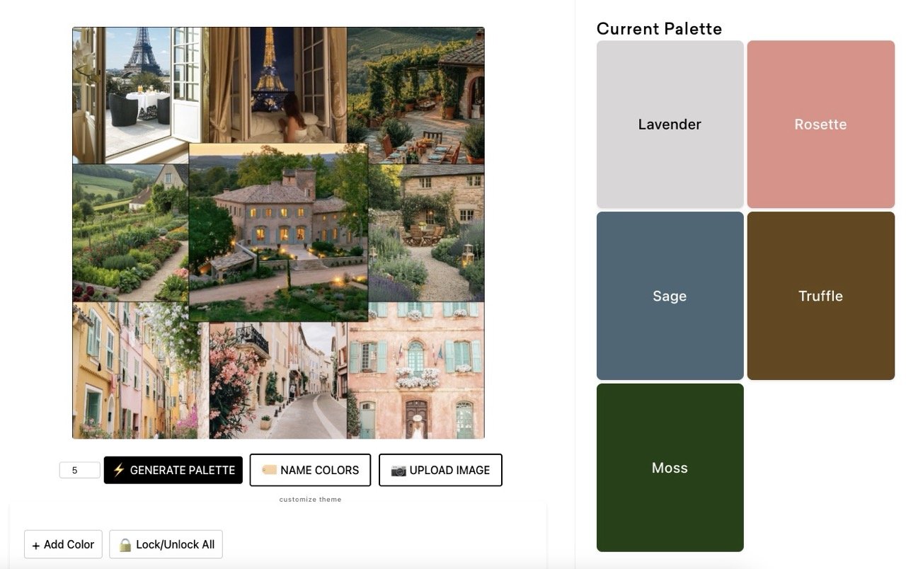
Then comes the fun part: uploading the mood board. For this example, I've created a mood board for a fictional client. The vibe is Parisian, think French countryside with interesting greens, blues, and muted shades. It's going to make for a fun website color palette.

Generating Initial Palettes
With the mood board uploaded, all that's left to do is click "generate palette." The tool then generates a range of color palettes based on the mood board's colors. I keep clicking "generate palette" to cycle through different versions until something catches my eye. I can lock colors I like and keep regenerating until I have a full palette that I want to work with.
Analyzing and Adjusting the Palette
Once a palette starts to take shape, I like to move the colors around and reorder them. Since I design Squarespace websites, I tend to arrange the colors from light to dark with the accent in the middle to follow how it will be loaded into Squarespace. It's a simple thing, but it helps me visualize how the palette will work on a website.
Contrast Testing for Accessibility
Now, let's talk accessibility. It's super important to ensure your website is usable by everyone, including those with visual impairments. Color Palette Pro has a contrast tester that shows you how well your color combinations stack up in terms of accessibility.
I typically aim for a contrast ratio of 4.5:1, which is the standard for accessibility. The tool shows you which color pairs meet that contrast ratio. This is important for website accessibility and SEO. A strong contrast makes a big difference. It helps to have a good mix of colors, with light and dark background options. This tool allows me to see if I have enough variety to suit my client's brand and the design of their website. Some may only need a few pairs, and others may require several.

Adding Personality: Naming Colors with a Theme
Beyond Hex Codes
Let's face it, hex codes aren't exactly inspiring. That's why I love to give my colors names.
Leveraging the Theme Feature
Color Palette Pro has a feature where you can designate a theme for your palette, and it generates names to match the theme. This is where the "Customize Theme" option comes in. You can type in a theme, like "French Countryside," and the tool generates color names to match.
In this case, it came up with names like lavender, rosette, sage, truffle, and moss. How cool is that? When I present a palette to a client, these names resonate with them far more than hex codes or generic names like "gray" or "blue." Connecting the colors to the theme and inspiration helps clients connect with the palette on a deeper level.
Selecting Approved Pairs
After settling on a palette, I double-check that the accessibility meets my needs and then mark the "approved pairs." These are the color combinations that I know work well together in terms of contrast and aesthetics.
Sharing the Vision: Exporting and Communicating with Clients
Exporting the Palette
Once I'm happy with a color palette, it's time to share it with the client. Color Palette Pro makes this easy with its export function. I can select which codes I want to include (I always include hex codes since they're the most versatile). I also include the color names and the approved color pairings so the client can see which combinations work best.
I can then download the palette as a PNG file and send it to the client. It's a clean, professional way to present the color scheme.

Saving in Projects
I can also save the palettes in my projects area so I can come back and work on them later, if needed.
Using the Color Buddy Chrome Extension
But here's where it gets even better. Color Palette Studio offers a free Chrome extension called Color Buddy. This free color palette Chrome extension saves you time by letting you save your color palettes and approved pairs right in your browser.
No more searching for files or digging up hex codes. Everything is right there at your fingertips. I always recommend this extension to my clients.
Color Buddy in Action: A Seamless Workflow
Copying the Studio Code
To use Color Buddy, you simply copy the "Studio Code" from Color Palette Pro. It looks like a jumbled mess of characters, but don't worry about that. (I will copy and share this code with my client so they can add it to their extension.)
Importing into Color Buddy
Then, go to the Color Buddy extension and create a new palette. Give it a name and paste the Studio Code into the designated field. Click "populate," and boom! The extension automatically populates each color with its hex code.


Quick Access and Copying
From there, you can quickly copy any hex code you need. Whether you're working in Canva, Squarespace, or any other design platform, the hex codes are just a click away.
Approved Pairings at Your Fingertips
But the real magic, in my opinion, lies in the approved pairings. Color Buddy also imports those pairings, so you can quickly see which color combinations are safe to use in terms of contrast and accessibility. This saves a ton of time and eliminates the need to remember where you saved the file with that info.
The Power of Choice: Presenting Two Palettes
Why Two Palettes?
I typically create two color palettes for my clients. This gives them options and allows them to choose the one that resonates with them the most. Limiting it to two also keeps them from getting overwhelmed with options. I also don't like them to be too similar, because that also muddles the waters for clients. I want them to have a choice between two distinct palettes.
Creating a Second Palette
To create a second palette, I go back to Color Palette Pro and use the same mood board. However, this time I aim for something different. As I mentioned, I want the second palette to be a departure from the first, perhaps more vibrant or with a different overall feel.
Contrast Considerations
When generating the second palette, I pay close attention to the contrast ratios. If the initial results aren't great, as we see in the video, I use the "Get More Pairings" option to add colors that improve the contrast. This is an excellent feature of the Color Palette Pro because it saves time when finding good options to add.
Refining the Palette
Sometimes, adding colors to improve contrast can result in having more than the desired five colors. If that happens, I carefully remove colors until I'm back down to five, making sure to maintain a good balance and variety.
Finalizing the Second Palette
Once I'm happy with the second palette, I rename the colors (again!) and export it, ready to be presented to the client.
Presenting the Options
I present both color palettes to the client, along with font pairing suggestions. I explain the importance of contrast and why a pairing they love may not work best for the website. I then show how the colors will be used in their Squarespace web design. This helps them visualize them on their website and make an informed decision.
Conclusion: Embracing the Creative Journey
I hope this peek behind the scenes has been helpful! Creating website color palettes is a creative journey that I love to immerse myself in, and the tools from Color Palette Studio, especially Color Palette Pro, make it fun and easy. And don't forget the free Color Buddy Chrome extension that allows you to create and save multiple color palettes for different projects or clients. I use it all the time!
If you've caught the color bug, be sure to check out Color Palette Studio! If something catches your eye that you wanna buy, you can save 10% using my affiliate link!
Do you like these peeks behind the scenes of my business? Let me know if you’d like to see more content like this. If you have any questions, drop them in the comments below!
You may also find these articles helpful: