Squarespace 7.1 Update: How to Align Content Blocks Effortlessly
Have you been using the Fluid Engine editor in Squarespace? Maybe you're a pro at it and love it, or maybe you're a beginner and just starting to get the hang of it? Either way, this post has a great time-saving tip for you!
How to Align Multiple Blocks of Content at Once
Squarespace released a minor update in the Fluid Engine editor that allows you to align multiple blocks of content with the click of a button.
It may not sound like much, but it's a small change with a big impact that makes designing much easier and quicker.
YOUTUBE VIDEO
I’ll walk you through the process of how to do this below, but if you prefer watching a tutorial, be sure to view the companion video on my YouTube channel.
Step by Step: How to Align Multiple Content Blocks
Step 1: Select the blocks you want to align
Using your shift key and mouse, click on each block you want to align. (Alternatively, if it’s enabled on your site, you can drag your mouse over the blocks to highlight and select them.)
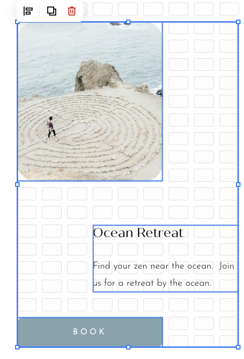
As shown below, I have selected an image, text, and button block I wish to align. And in the upper left corner, there is an icon that looks like two horizontal rectangles with a vertical line to the left of them. This is the option for setting alignment.
Step 2: Choose the alignment you want to use
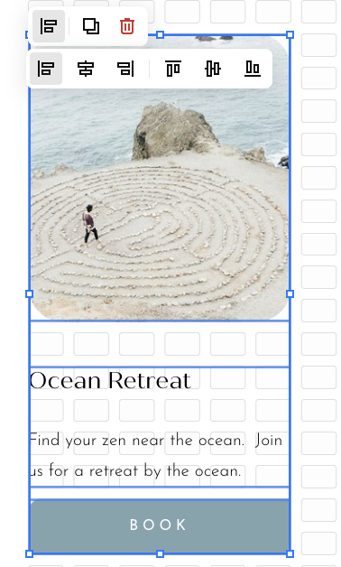
If you click on that icon, all of the options will appear as shown below.
Your options are from left to right:
Align Horizontal Left
Align Horizontal Center
Align Horizontal Right
Align Vertical Top
Align Vertical Center
Align Vertical Bottom
Here are examples of what those will look like:
Align Horizontal Left
Vertical Alignments
In these images, only an image and a button block are selected to align. This illustrates how you can place a clickable item over an image if you choose.
Align Vertical Top
Align Vertical Center
Align Vertical Bottom
Step 3: Save your work
Once you have your blocks exactly how you want them to appear, hit Save!
Tips to make the most of this feature
This feature can be very useful if you want to recreate a series of blocks in a section. For example, if you are highlighting multiple services or products, you can create one, format and align the elements exactly how you want them, and then with all the blocks selected, hit “duplicate.”
Voila!
Now all you need to do is update the image or text for that service/product and you’re done!
No more recreating each block and aligning them separately with every service/product!
And if you do this to create a section you love, be sure to save that section (click on the heart ♥️ in the section editor menu) so you can re-use it in the future!
And that's all there is to it! It's a simple and minor update to the design editor, but it'll make your life a lot easier by saving you a few extra clicks and frustration during your design process!
You may also find these articles helpful:


